Packaging
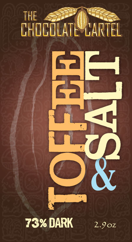
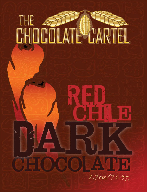
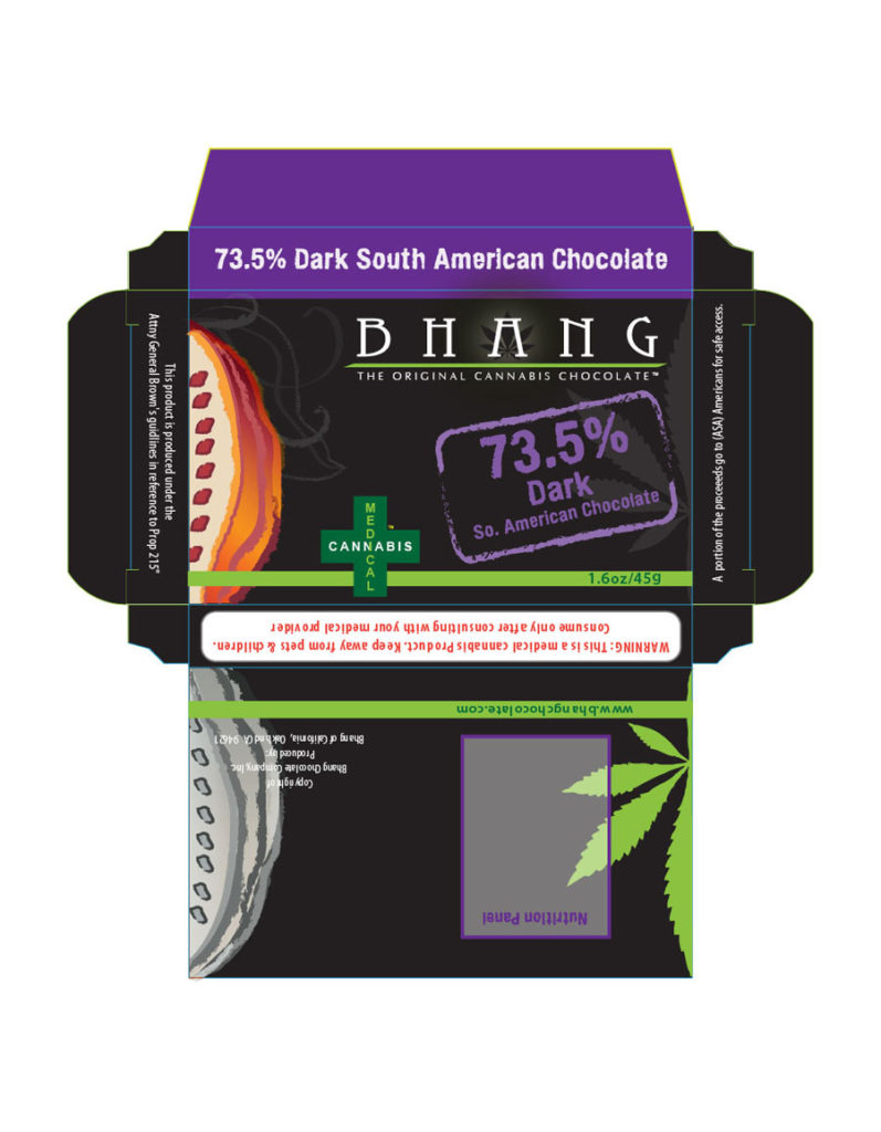
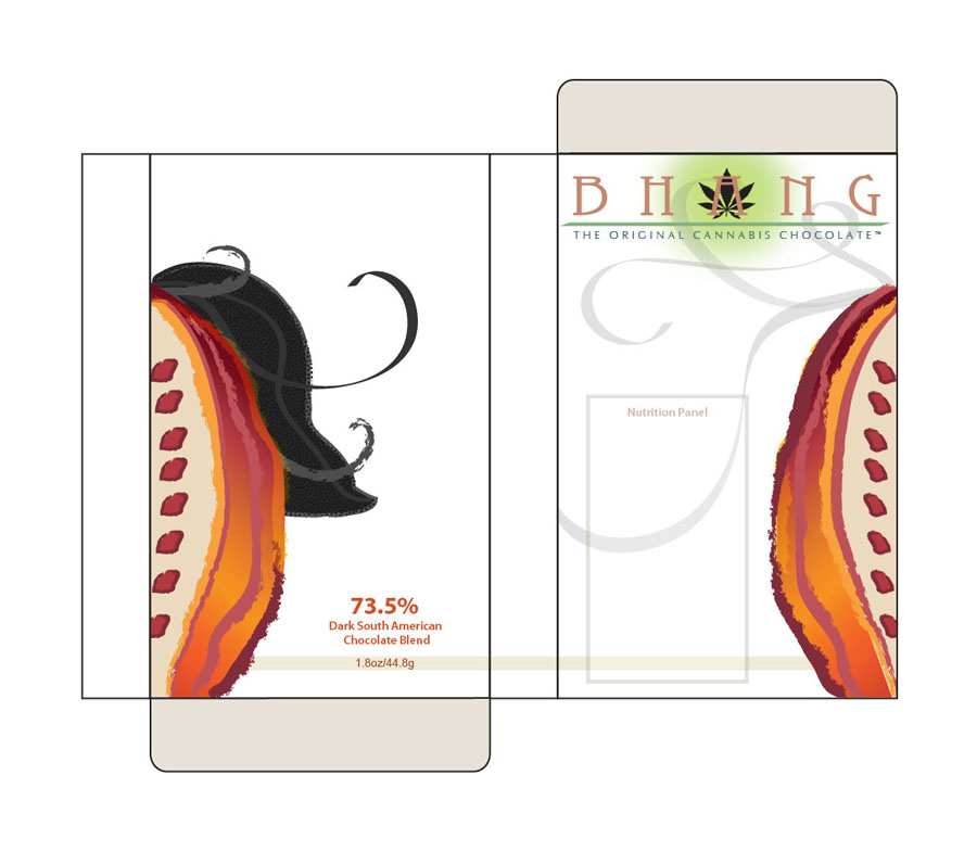
Packaging has a unique design problem-solving attribute - it requires the designer to think in three-dimension. How will the design wrap around the package surface? Where will the nutrition panel go? How do the colors reflect an appetizing product and the branding? How cohesive are each of the products to each other and the branding?
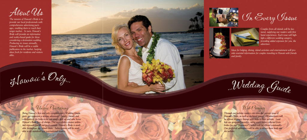
This is a folder that was designed as a media kit for the launch of Hawaii's Bride Wedding Guide in 2008. The folder was a project in precision to line up the "swoosh" from the inside to the outside. Also, to line up the printed flap, the pocket of the folder, to line up on the middle panel on the inside. In other words, the swoosh on the flap/pocket (shown in the first image as the middle upside down part), folds up to the inside, lines up with the swoosh inside, and makes a pocket in the middle of the inside. If you were to peek into the pocket, you would see the same printed image of swoosh and flowers. What you are looking at, in the inside folder is what was printed on the inside. This was printed in one piece on each side!


